Kasutad veebilehitsejat, mida tootja enam ei uuenda. Palun vaheta veebilehitsejat või laadi turvaliseks internetikülastuseks ja meie veebilehe sisu õigesti nägemiseks alla uuem brauser:
Typography usage
How to use typography in Merko general branding
for headings
for intro
for body text
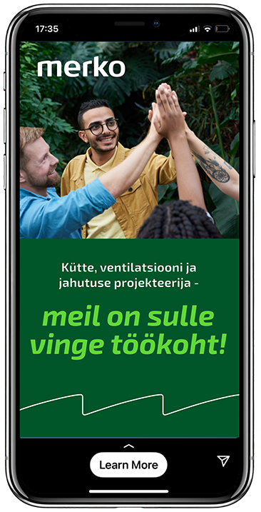
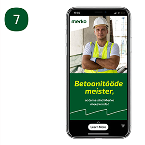
How to use typography in Merko employer brand
for headings
for intro
for body text
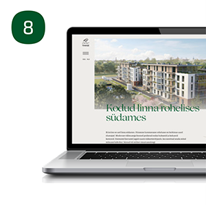
How to use typography in Merko residential brand
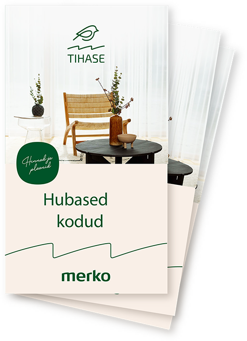
Print materials - print ad, booklet etc.
to use in bubble
headings
for intro
for body text
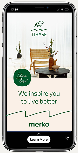
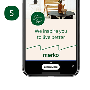
How to use typography in Merko residential brand
Digital channels - SoMe, web banner etc.
to use in bubble
headings
How to use typography in Merko residential brand
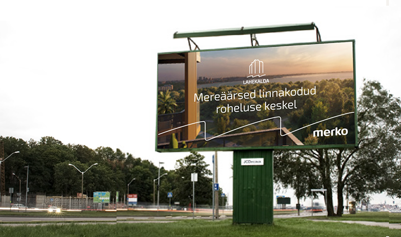
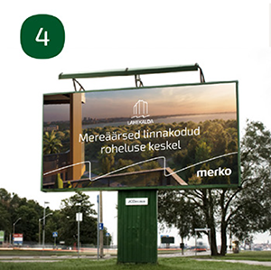
Outdoor ads
for headings
Use Exo2 Medium only on naturally calm and clear photos.
for headings
Depending on the photo, Exo2 Bold is also an option for outdoor ads. If the photo is rich in details, use Exo2 Bold to ensure clear readability.
How to use typography Summary
for subheadings
for body text
for body text
b) on visually “noisy” photo
for info bubbles (New!)
for info bubble in Cyrillic
for subheadings
for body text
for body text
for names, excerpts
Caps Lock texts in the beginning of topics)
How to use typography -
size and weight
Exo2 Bold,
Exo2 SemiBold,
Exo2 Regular
Sentence case
In our typography we always use sentence case text, such as ”We inspire you to live better”. We avoid using ALL CAPS. If you need to create typographic hierarchies, use different weights and sizes instead.
Typography on an image
When placing typography directly on an image, place it on a calm part of the image. Another option is to use transparent colour layer on the image to emphasize text on it.
Do’s and dont’s
Use sentence case like this.
Do 
Always use sentence case.
DON’T
USE ALL
CAPS
Don’t 
Don’t use all caps.
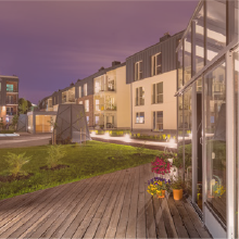
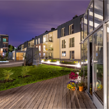
Veerenni kodud
Do
Use transparent colour layer between the image and the text. Set the blending mode of the layer to “Multiply”.
Veerenni kodud
Don’t
Don’t use text directly on an image, especially if the image is visually too “noisy”. Use text directly on the photo only if the photo is naturally enough dark or light and calm.