Kasutad veebilehitsejat, mida tootja enam ei uuenda. Palun vaheta veebilehitsejat või laadi turvaliseks internetikülastuseks ja meie veebilehe sisu õigesti nägemiseks alla uuem brauser:
Merko Visual Identity Guidelines
Our graphic world is inspired by the constant progress and movement found in construction and cityscape. We use the graphics to stand out, to create inspiring visuals, and to help to clarify and guide information usage.
One Merko
WHY?
Our purpose
We create a better living environment. We build into the future.
We are inspired by projects that improve life quality and influence the future. Homes and living environments we create as well as projects built for our clients will remain in Estonia, Latvia, Lithuania and Norway for years. We take great pride in our work and focus on quality, client needs, end result and social impact in order to contribute to the development of countries of our home markets.
WHAT?
What business are we in?
We construct buildings and infrastructure and develop real estate. We operate in the Baltic countries and Norway
The heart of Merko is in construction. We have flexibility to implement various projects and capability to tackle complex challenges. We focus on areas that add value to our core business. In real estate develop ment we build quality homes for thousands of households in Tallinn, Tartu, Riga and Vilnius and create modern and high-quality living environments.
HOW?
Main operating principles of the group
We operate as one Merko.
- Each employee is an ambassador of Merko, everything we do influences our reputation – we follow common values and operating principles
- Cooperation and shared experience creates highest value for everyone
- We act according to Merko’s high standard
We see opportunities, act upon them and have a long term view.
- We are entrepreneurial, identify opportunites and act before others
- Good preparation ensures better decisions and best execution
- We decide from long term perspective.
Our focus is on profitable growth.
- Our decisons are guided by long term financial results
- We are in close touch with the market
- We are in close touch with the market and our business and make quick adjustments as needed
Common values
I am competent
I value quality, professionalism and cooperation. I continuously develop my knowledga and skills.
I keep my word
I give realistic promises and keep them. Best agreements are developed in good cooperation.
I care and take responsibility
My decisions are driven by business results and ethical standard. I develop sustainable, efficient and envirnomentaly friendly solutions.
I initiate and make it happen
I notice opportunities and take up challenges. Our commun result depends on me. I aim higher and drive to achieve more.
I look for new ideas
I am open minded to develop and implement pioneering solutions.
Logo
Our logotype is the main carrier of the Merko identity and is used as our guarantee.

Green is our primary brand colour which differentiates us from our competitors and should always be present. To communicate in various channels and ways, we use a spectrum of different greens. Merko Green is a new colour in the Merko palette. It is fresh and warm, a bit darker than the current green, which makes it more premium. Use it in marketing and brand materials for advertising purposes, especially on large-scale advertisements

LOGO MERKO’s main visual identity element is the LOGO. The logo consists of a SYMBOL (a stylized letter M) with fixed proportions and position and WORDMARK.

SYMBOL The symbol without the wordmark can be used for individual decorative cases where the informational aspect is not of main importance.

WORDMARK Use the wordmark where the communication is clear and Merko brand is recognisable. For example outdoor ads, construction site branding etc.

SAFETY ZONE Safety zone is quite simple - free space around the logo should never be less than letter O.
Special Logos
A logo with a specific, narrower focus, created for events, anniversaries or inner communication campaigns, developed as part of the company's marketing activities.

MEIE MERKO Merko’s values

ONE MERKO Merko’s values

MINI MERKO Mini Merko marks the theme of the successor brand.

SINU MERKO Your Merko marks the stories of our clients. Used in residential brand, SoMe.
Residential development logo
Residential development logos are part of Merko group and carry Merko's visual identity. They consist of symbol, M wave and project name. Detailed logos are created during developing the specific residential development brand.

Always use the same line thickness in symbol and M wave.
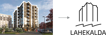
Specific symbol is derived from development’s name or charactertics.

If the proportions allow, the logo can be used on bubble background - decide it upon the design. Background is better on the “noisy” photo. On calm photo prefer logo without background.
Residential development logo uses by default Exo2 font. Special cases of different font and logo use are allowed, e.g. in case of cooperation projects or especially largescale development projects.


Colour usage
Monochrome (one colour) logo is allowed only in black and white. In special cases also in gold or silver print.

Two colour logo on white background

Two colour logo on light neutral background
Two colour logo on light photo background

Black logo on light contrast plain background
Black logo on light photo background

White logo on dark plain background
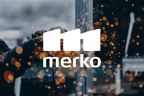
White logo on dark photo background
Colors
We are green! But now, together with a supporting palette of natural warm colours, we aim to be cosier and trendier. And in combination with brighter hues, to create a lively, future-oriented expression.
Merko brand palette

RGB 0 / 85 / 41
PMS 7734 C
RAL 6002 Leaf Green
#005529
Merko Green equivalent colours in vinyl sticker series:
Avery Dennison 500 - 533EM, Forest Green Oracal Economy Cal - 613M, waldgrün, forest green
Green is our primary brand colour which differentiates us from our competitors and should always be present. To communicate in various channels and ways, we use a spectrum of different greens. Merko Green is a new colour in the Merko palette. It is fresh and warm, a bit darker than the current green, which makes it more premium. Use it in marketing and brand materials for advertising purposes, especially on large-scale advertisements

Complimentary colours
To guide and clarify information, we have complementary colours:

RGB 140 / 198 / 63
PMS 356 C
RAL 6029
#8cc63f

RGB 244 / 242 / 239
PMS 2330 C
RAL 9018
Papyrus White
#f4f2ef

RGB 227 / 222 / 216
PMS 406 C
RAL 7038
Agate Grey
#e3ded8
Functionality colours
Merko Office Green is already familiar from Merko logo. It has a better contrast on white backgrounds, therefore use it in corporate, everyday work documents, materials and smaller formats (e.g. e-mail, letter templates, e-mail signature, reports, calendar etc). Black, white - to use in texts.

RGB 0 / 111 / 61
PMS 356 C
RAL 6029
#046F3D

RGB 35 / 31 / 32
#231f20

RGB 255 / 255 / 255
#FFFFFF
Celebratory colours
To use in order to enrich the existing colour palette in special and celebratory cases, to emphasize a really premium feeling. Gold and silver to be combined with the right green tone, usage depends very much on certain material and production technology.

Metallic

Merko employer brand palette
Use only one neon colour per layout on Merko Green background.

RGB 96 / 217 / 55
PMS 802 C
RAL 6038
Luminous Green
#60d937

RGB 214 / 249 / 6
PMS 809 C
RAL 1016
Sulfur Yellow
#d6f906

RGB 255 / 255 / 255
#FFFFFF
Merko residential brand palette

RGB 250 / 240 / 231
PMS 2309 C
RAL9001
Cream
#faf0e7

RGB 244 / 242 / 239
PMS 2330 C
RAL 9018
Papyrus White
#f4f2ef

RGB 227 / 222 / 216
PMS 406 C
RAL 7038
Agate Grey
#e3ded8

RGB 199 /193 / 187
PMS P 178-1 C
RAL 7004
Signal Grey
#c7c1bb
Primary typeface
We use Exo2 as our primary typeface. It is universal and modern.
Exo 2 font family has lots of different thicknesses, but in our branding we use following styles:

If you need an alternative font (required for technical cases or you don’t have Exo2 fonts installed, we recommend Calibri system font.
However, the alternative typeface is not part of the Merko identity.

Residential brand typography
For residential branding, there are following fonts used: Lovelace Text Regular, Sidecar Bold, Piazzolla and IBM Plex Sans.
Other fonts can be used in bigger co-projects web and overall branding (for example Veerenni), but these are special cases and these designs are managed by agencies responsible for certain co-project.


Graphic
elements
Our graphic world is inspired by the constant progress and movement found in construction and cityscape. We use the graphics to stand out, to create inspiring visuals, and to help to clarify and guide information usage.
M wave
It all starts with the M. The M wave is derived from Merko symbol. It carries a feeling of movement and dynamic. On designed materials the M element functions as a subtle reminder of the brand presence. The M wave is the basis for layout creation and can be used throughout brand communication in different forms - either for layout logic, as a separate pattern etc.


Merko Bubble
Merko Bubble is playful tool for ephasizing different details on the layout - you can put the price, directional arrow or project logo on it or write short sentences (e.g. New!).


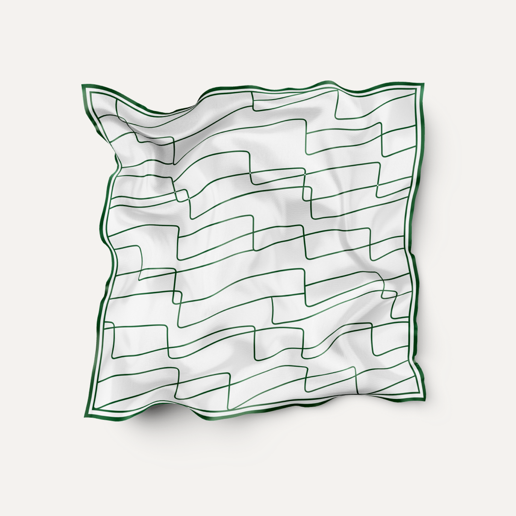
Pattern
Pattern is created by multiplying the M waves and combining the M waves together. Pattern can be used on print materials (e.g. gifts and stationery) and everywhere where the background is calm.
To create more emotion and playful feeling, it is also possible to use the existing pattern with different line weights.


Merko Tag
The shape of the Merko Tag is derived from the Merko logo shape. The Tag is meant to be used in the corner - upper left or lower right.

Merko tag with wordmark can be used in cases where the wordmark without background is not well visible (e.g. on very detailed photo)

Merko tag with symbol can be used in cases where the brand is well recognisable.
Imagery
Imagery is our most emotional tool.
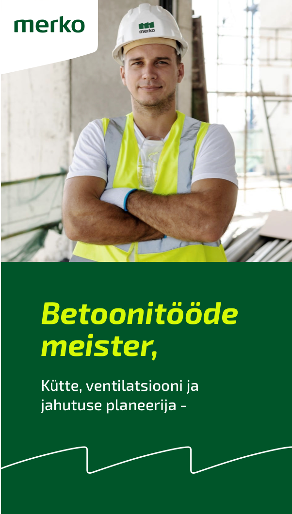
Image categories: Construction
Our construction imagery depicts and represents our experience in the field - specialists, skills necessary in the process of building, objects from construction site.
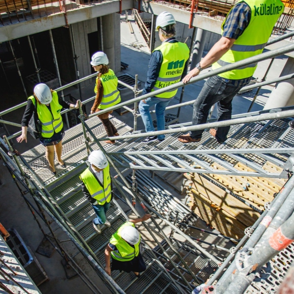


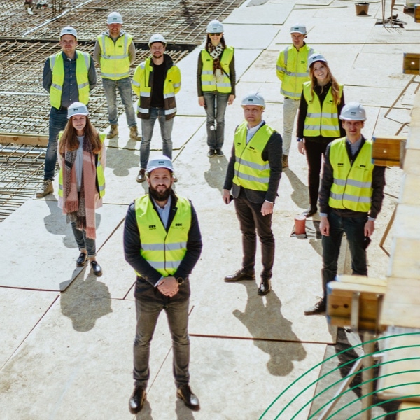
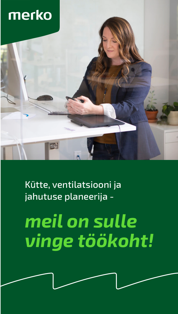
Image categories: Employer
Our employer imagery depicts our people - we have two types of portrait photography and team imagery. Portraits are either aimed for corporate web usage or residential development marketing usage. Team imagery is meant to be used in emplyer branding communication.

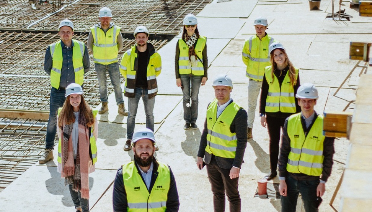
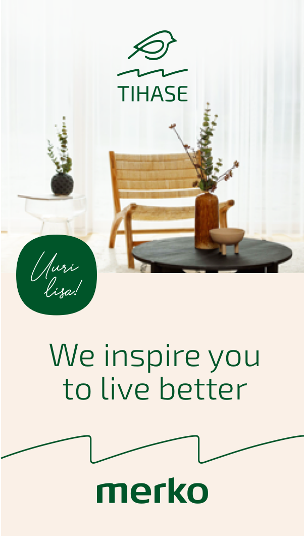
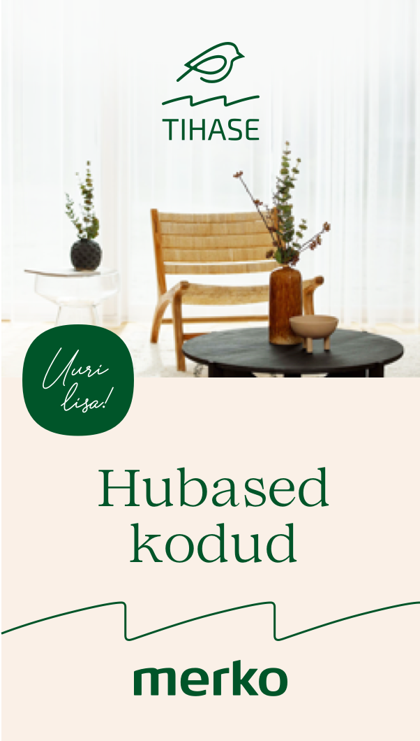
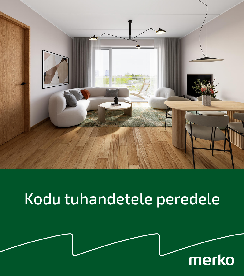
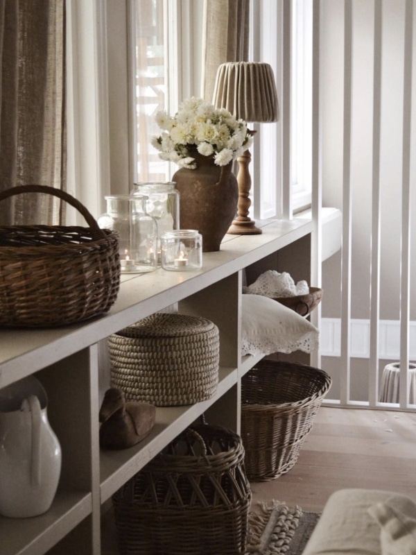
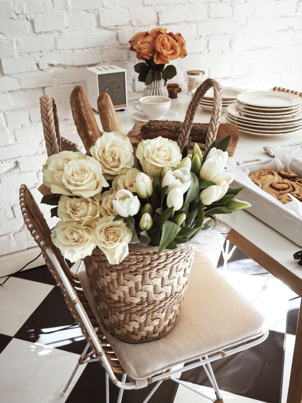
Image categories: Interior photography
Our residential development interior photography depicts a warm, modern, hygge atmosphere and sends a message of creating a homely environment.
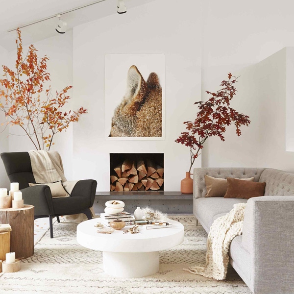
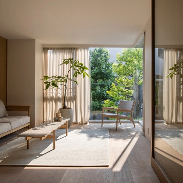
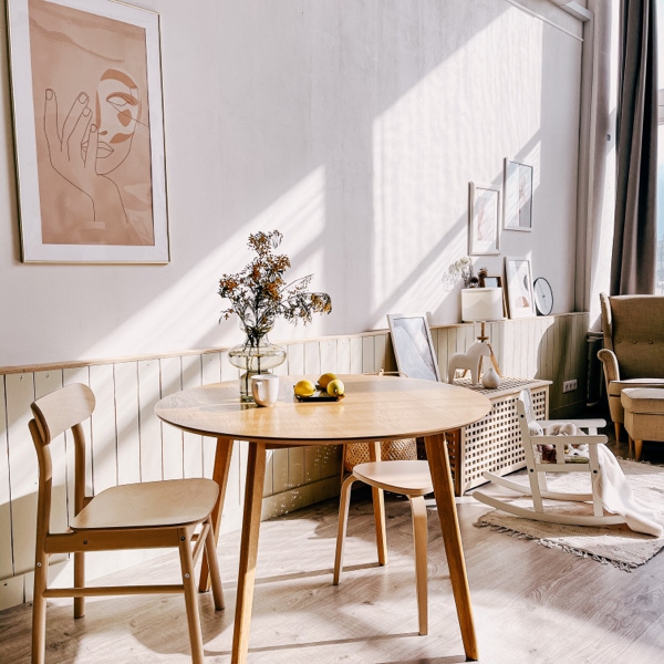

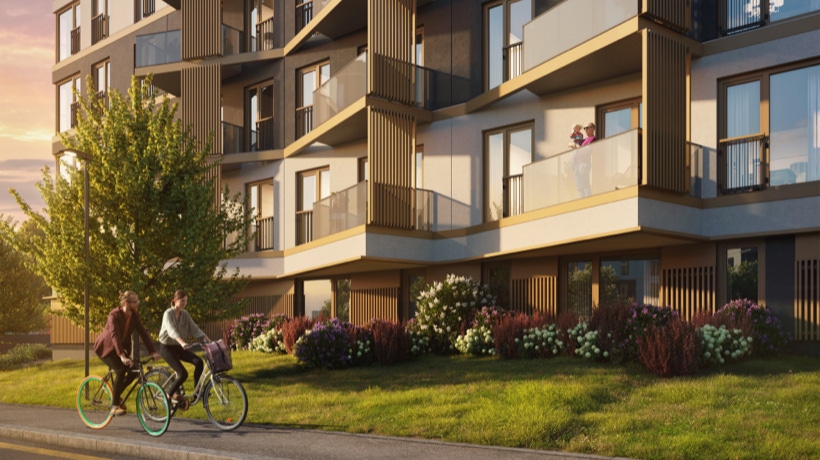
Image categories: Home & hygge
This is a new category of imagery. It is created to support marketing communication. Home and hygge imagery is designed to draw the attention and inspire the audience. Especially for usage in SoMe. People can also be seen in Hygge imagery - not in focus, but in their own environment, relaxing or doing something in background.
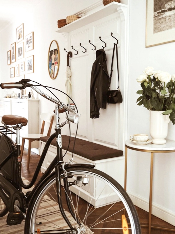

Displaying people in interior photography
Depict people in interior photography as if they were actually at home. Natural look and make-up are preferred - use light, neutral clothing. To show life and natural movement inside interiors, people can also appear blurred (picture taken upon movement).
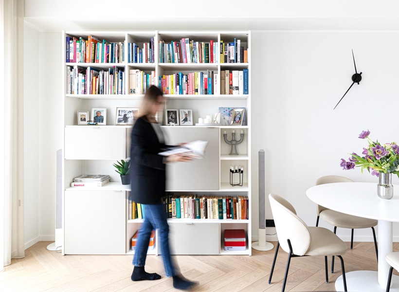
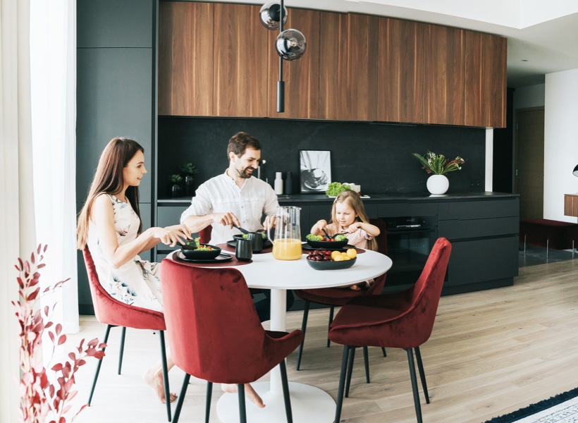

Image categories: Abstract architectural photography
This is a new category of imagery. It is created to support corporate communication and marketing in digital channels. Abstract architectural photography is a subtle visual tool that helps to send the message of Merko as an construction expert.
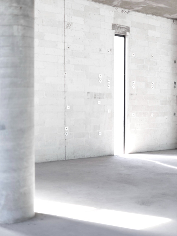
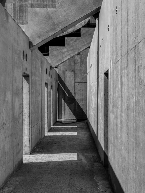
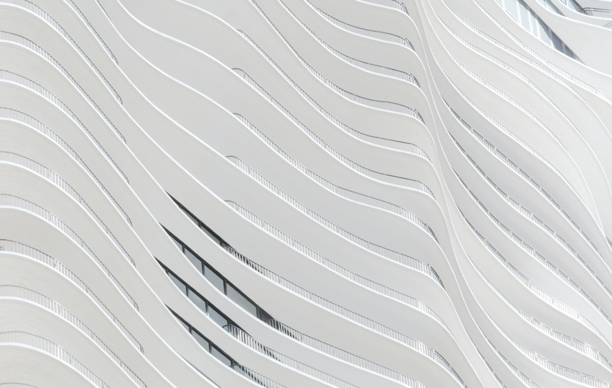
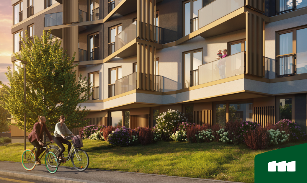
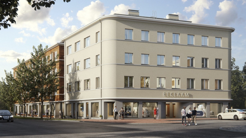
Image categories: Fake photo / 3D guidelines
To describe views that can be seen from residential premises, we use realistic photos taken from the correct height. We don’t show buildings from bird-view (roofs in focus) - they are impossible to relate to as no person can actually see such a view. The focus of the image is the central building, we don’t put too much focus on the surrounding buildings or new buildings in development stages.
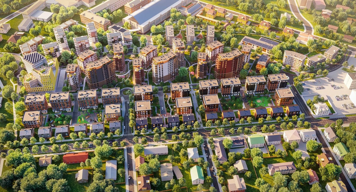
Bird-view photos are in order only in case of a large-scale development, e.g. depicting a whole block of building being developed. Or to showcase the neighbourhood.
Contact
Nothing in this life is ever ultimately finished. In the same way, You should not think of the Merko brand as something that is completed now. In order to remain dynamic and relevant, development and continuous improvement of the existing are welcome.
For all questions regarding the visual identity of Merko, please consult the marketing department.
Merko Ehitus group
Merit Kullasepp Communication and Marketing Manager
merit.kullasepp@merko.ee
Estonia / Merko Ehitus Eesti
Construction and corporateKätlin Kaasik
katlin.kaasik@merko.ee
Latvia
Merks and Merks MājasSanita Buķe
sanita.buke@merkolatvia.lv
Lithuania
Merko Statyba and Merko BūstasOksana Vaitkienė
oksana.vaitkiene@merko.lt
Real estate developmentEva-Maria Leetma
evamaria.leetma@merko.ee
Kadri Pajumaa
kadri.pajumaa@merko.ee